The Daily Detox
Overview
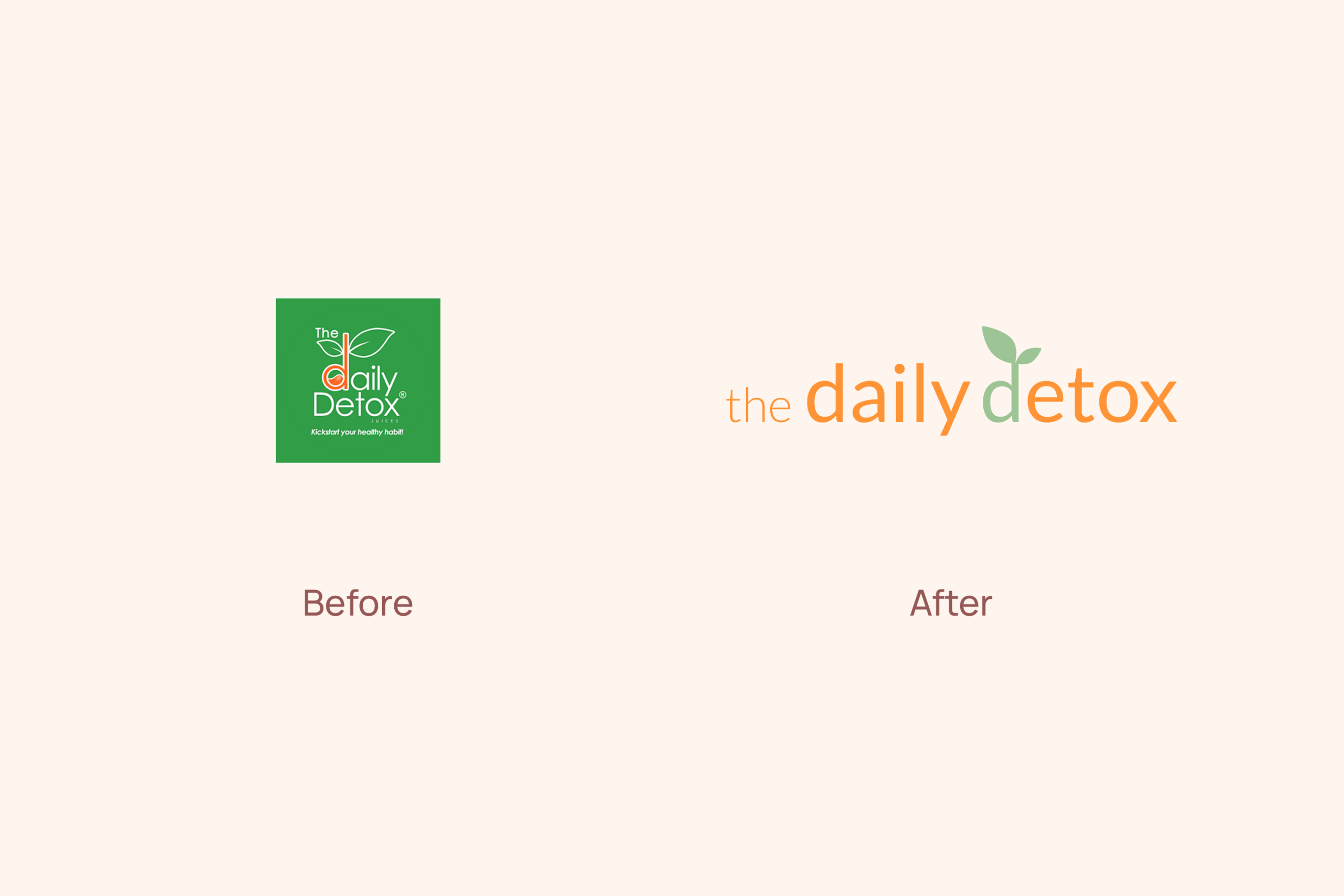
The Daily Detox is a successful juice chain in the Philippines, operating since 2014 with 16 locations. Known for its cold-pressed juices and detox programs, the brand had strong recognition but a visual identity that no longer reflected its quality or market position. This rebranding project aimed to elevate the brand into a premium, cohesive identity while preserving the essence customers already knew and trusted. The goal was to create a calmer, more refined look that could work seamlessly across bottle labels, packaging, store signage, and digital channels.

Target Audience
Health-conscious adults aged 25–40, primarily in urban areas, who value wellness, quality ingredients, and visually appealing products. They are regular café and juice bar visitors, active on social media, and drawn to brands that balance style with authenticity.
Design Process and Choices:
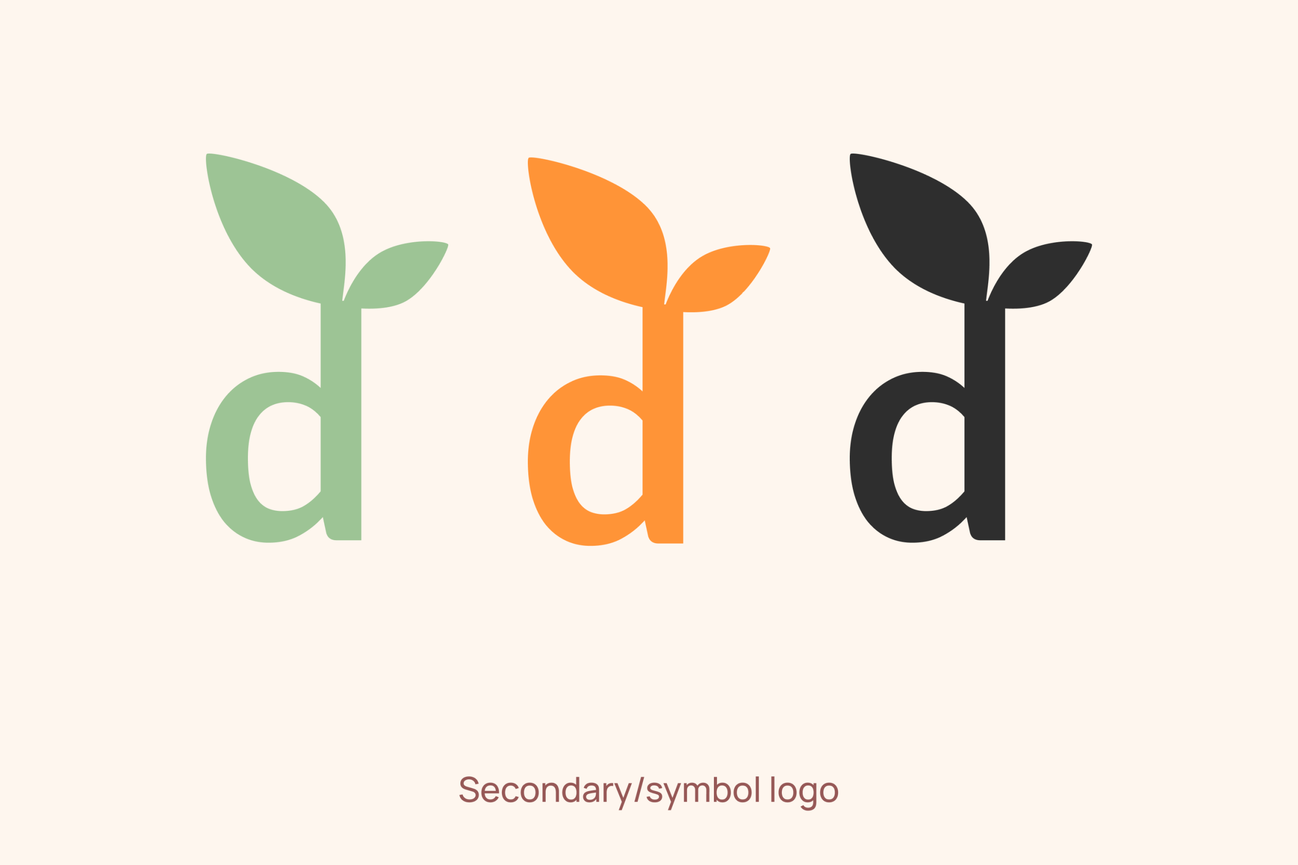
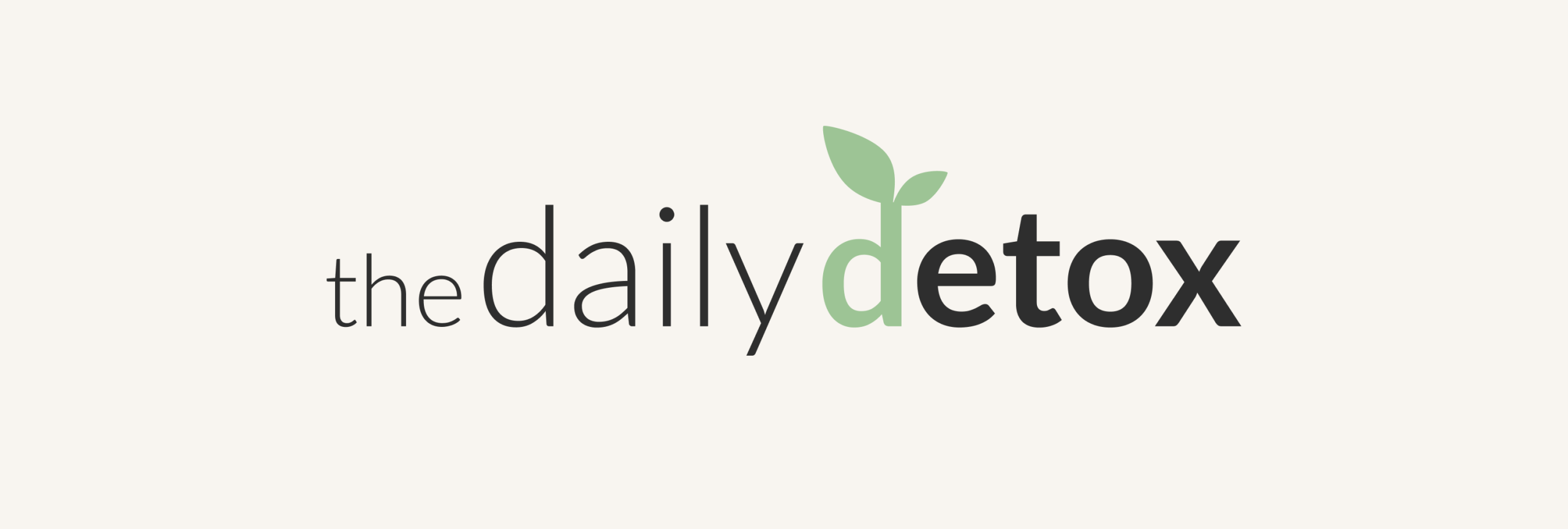
- Refined the existing brand identity to create a calmer, more premium look while keeping recognizable elements for customer familiarity.
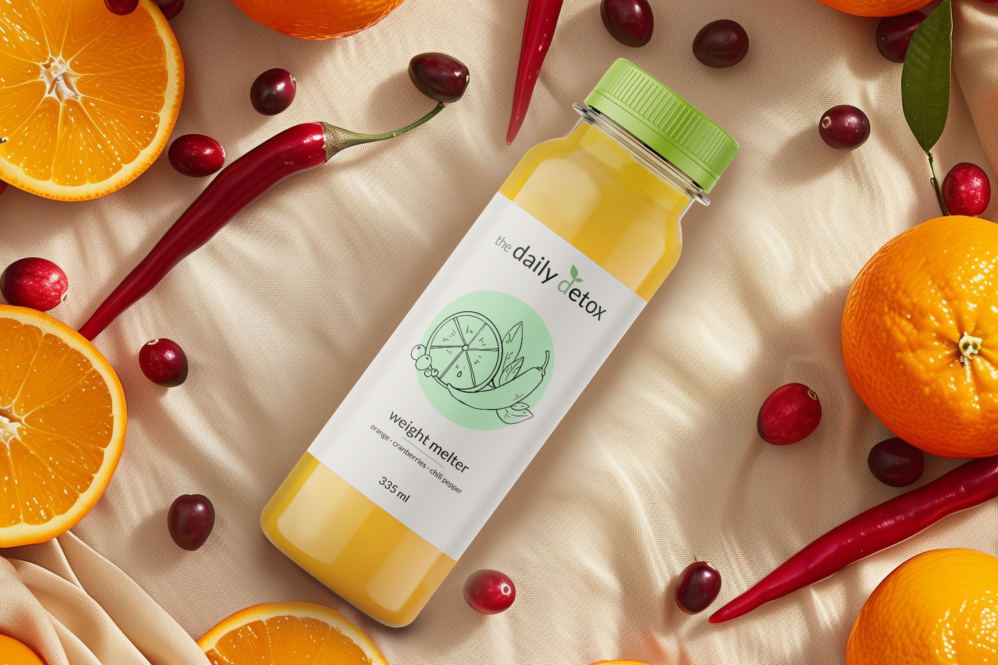
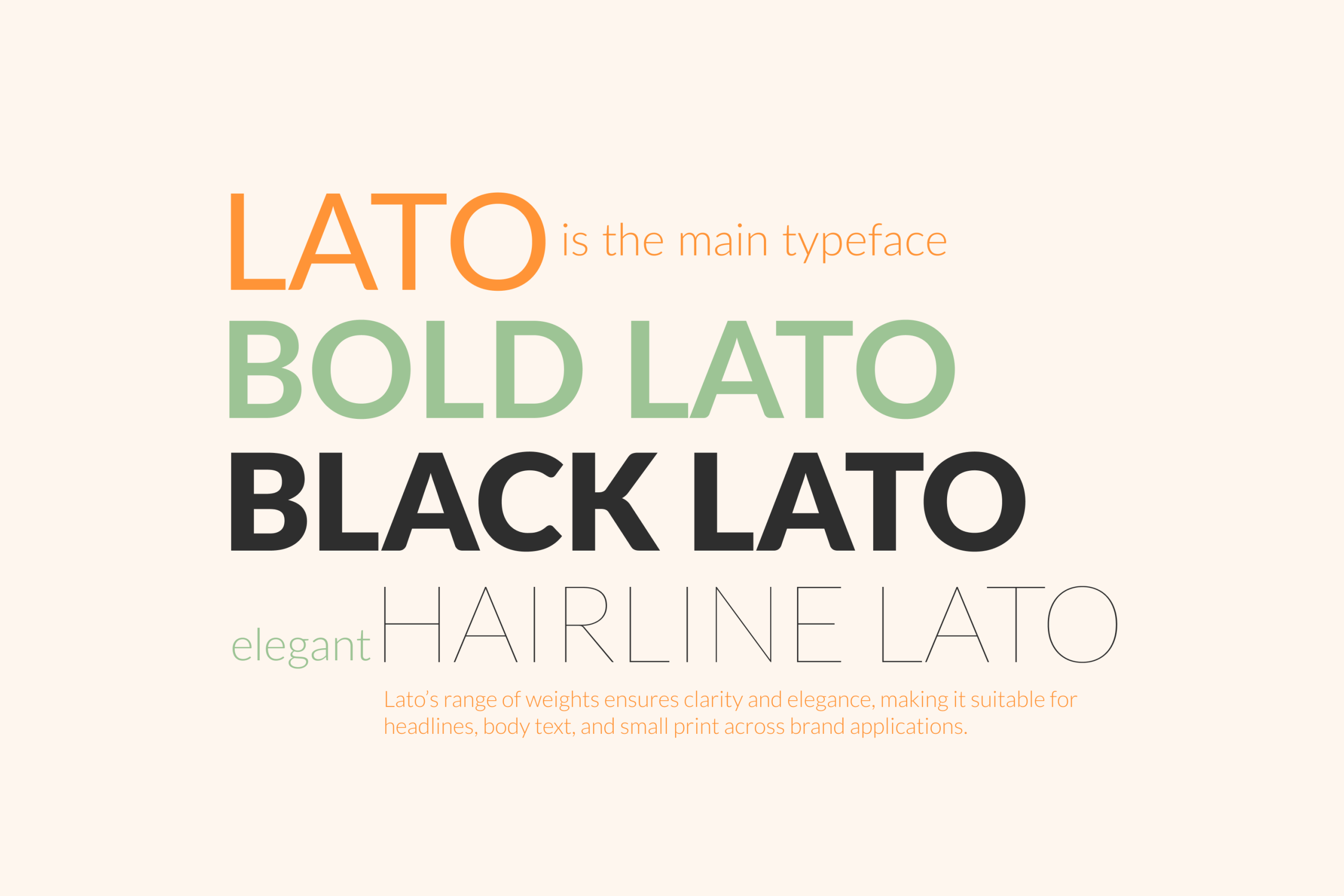
- Chose a clean, modern sans-serif typeface (Lato) in varied weights to maintain clarity and consistency across packaging, signage, and digital applications.
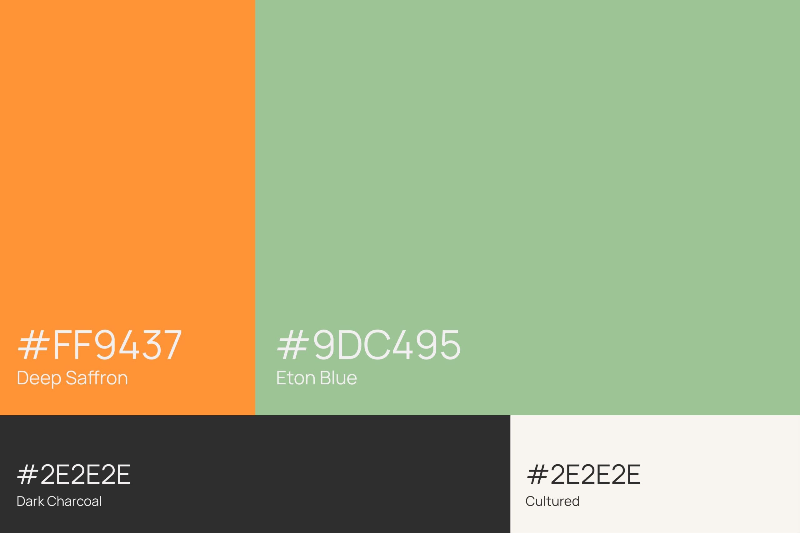
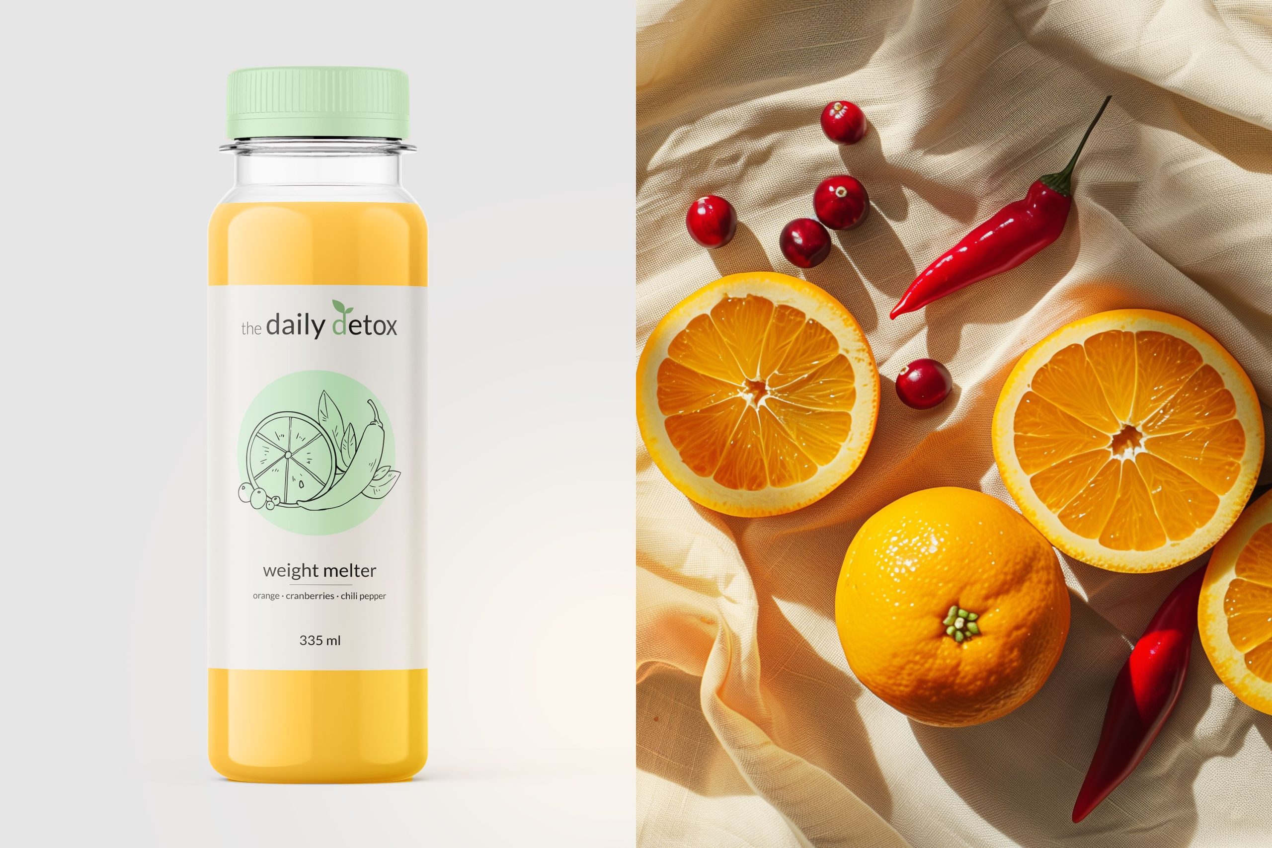
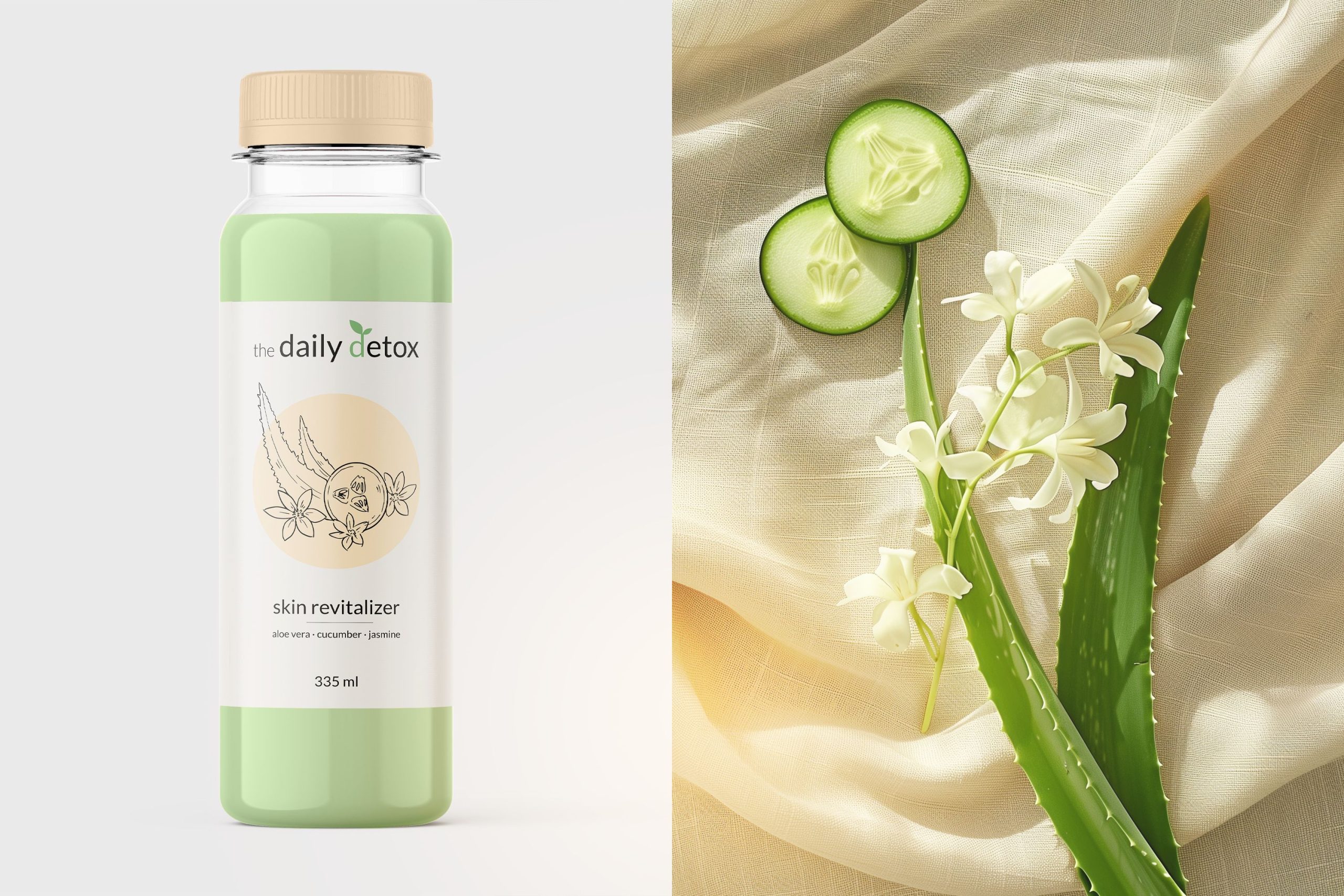
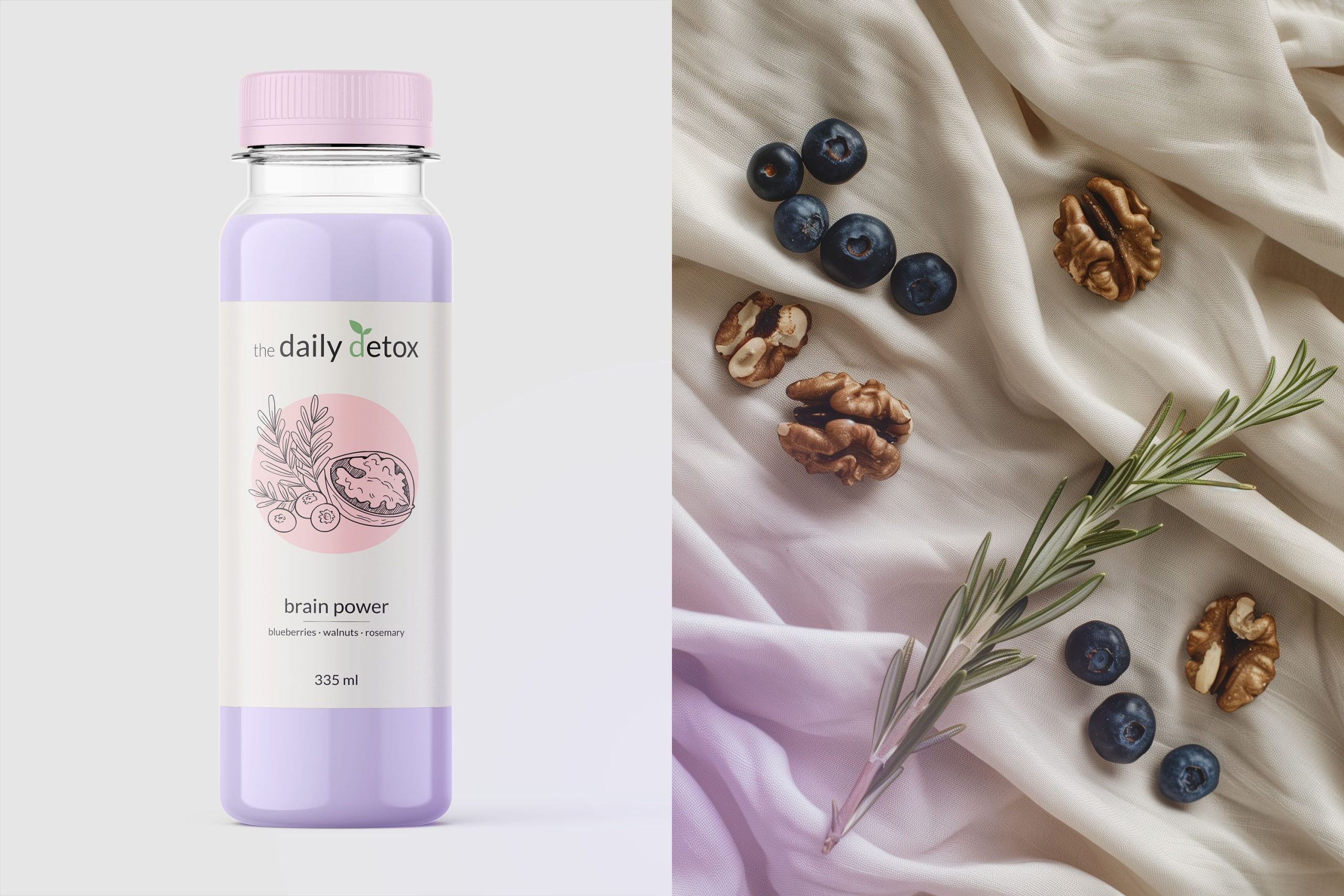
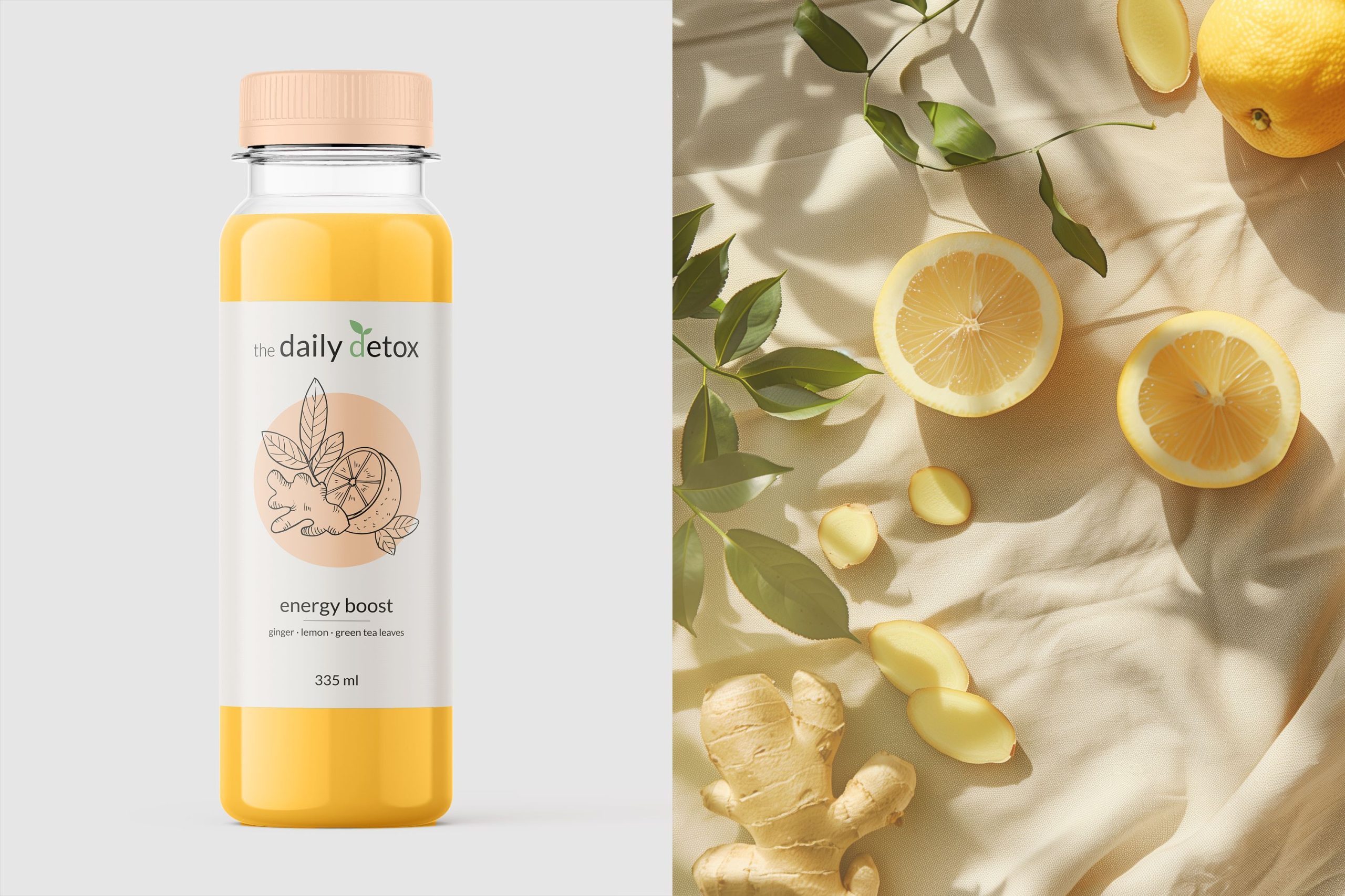
- Softened the original brand colors into muted orange and sage green, complemented by neutral cream and deep charcoal, to convey freshness, elegance, and approachability.
- Designed minimal, hand-drawn botanical illustrations for each juice variant to visually communicate ingredients and flavor profiles while reinforcing the brand’s natural positioning.

Projects